Web Design Trends to Try in 2018
Another year brings another set of design trends to the web. It seems like these trends are constantly advancing and while prior trends are still here, many new ones are ripe for the taking.
For this post, I’ve organized my picks for the best trends to look out for in 2018. Some of these are just emerging while others have been around (and growing) for a few years now.
Microinteractions on the Web
Basic animation is pretty easy to add onto websites nowadays. But there’s a movement towards more user-focused animations called microinteractions that originate from mobile apps and have been moving their way onto the web.
These work like animated responses to user behaviors. So if someone clicks a button or hovers to animate a dropdown, the microinteraction would respond accordingly in a realistic way.
This takes the form of bouncing effects, changes in 3D/depth of the page, and plenty of unique fading effects to show & hide page elements.
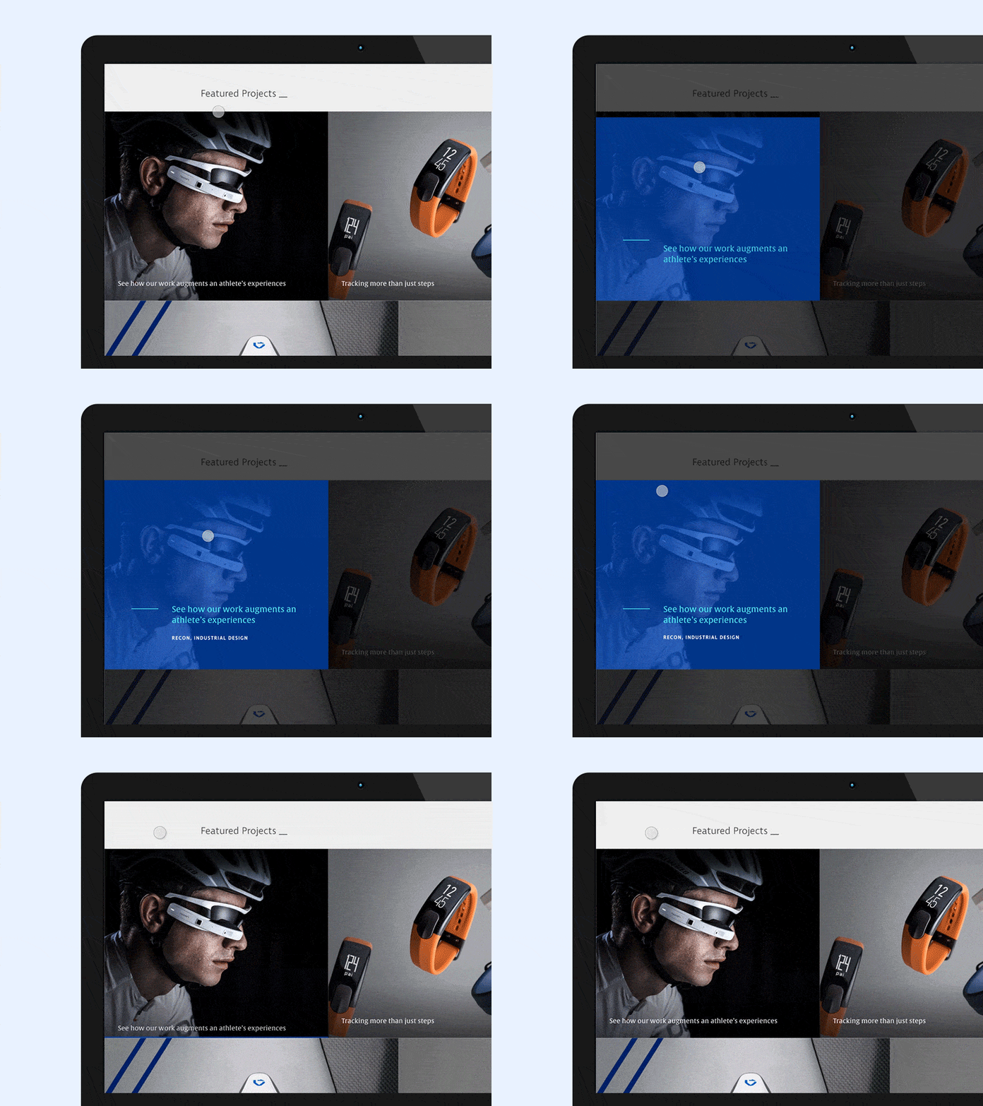
The above example is a nice UI animation following a hover microinteraction.
With Slides, we don’t make you start from an empty slate. All you have to do is to pick the elements you like best and combine them. Each slide has been carefully crafted to satisfy three key criteria: aesthetic, function and usability. That way you know every element works together seamlessly while enhancing the impact of your content.
Create a Website
It works on the metro card layout design and on hover it displays more information about the item in the grid. You can use this in portfolios, image galleries, or pretty much anywhere that has grid photos.
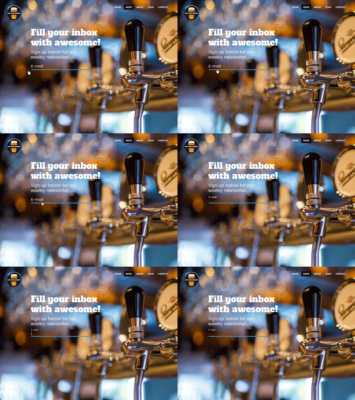
But microinteractions don’t have to be technical. For example, this shot by Liz Shinn demonstrates a floating email field using a custom animation effect.
And with a growing collection of open source scripts you have access to almost anything you could ever need right at your fingertips.
CSS3 and JavaScript both offer control over microinteractions. So it’s about finding the right library to suit your needs.
My newest favorite script is Anime.js which I absolutely recommend for any type of microinteraction development.
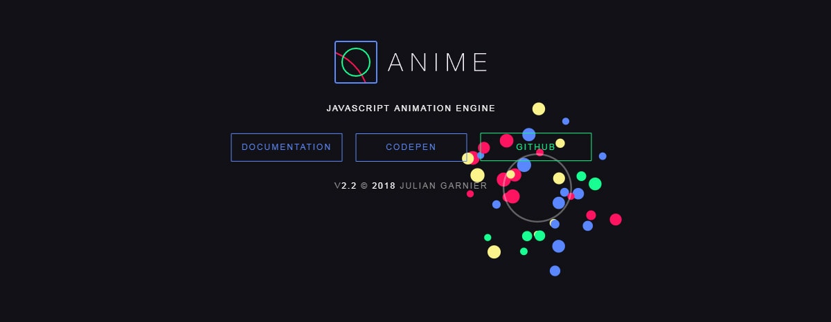
Just visit the homepage and try clicking anywhere. It’s certainly a boisterous animation and not something you’ll want on every website, but it shows just how powerful this library is.
“Featured In” Badges
This is a trend I often see on corporate websites and sales-y landing pages.
Badges often play on social proof where you’re showing what other blogs & magazines have to say about your site. Obviously, you want to feature the best reviews and coverage, but if you build great stuff this shouldn’t be too hard.
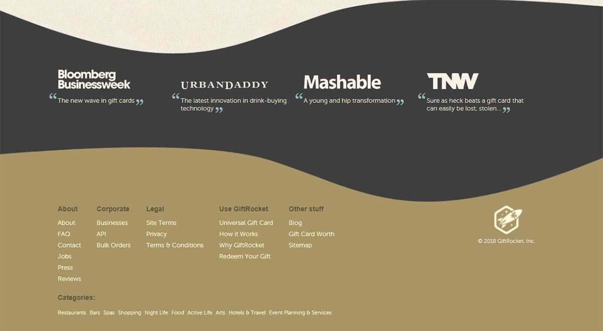
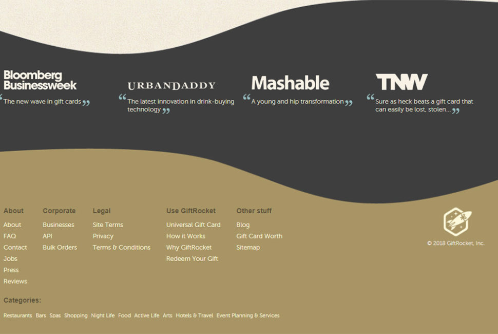
Scroll down a bit on the GiftRocket website to find a set of badges from major publishers.
Mashable, The Next Web, and Bloomberg and all big names in online content. By adding these logos into their homepage it tells visitors that GiftRocket is clearly a great product, mostly because other authoritative websites say so.
An alternative to this trend is adding special “used by” badges.
Again these are just logos of large brands to prove to people that your company is good. But instead of adding badges from news coverage you can add badges from major companies that use your product.
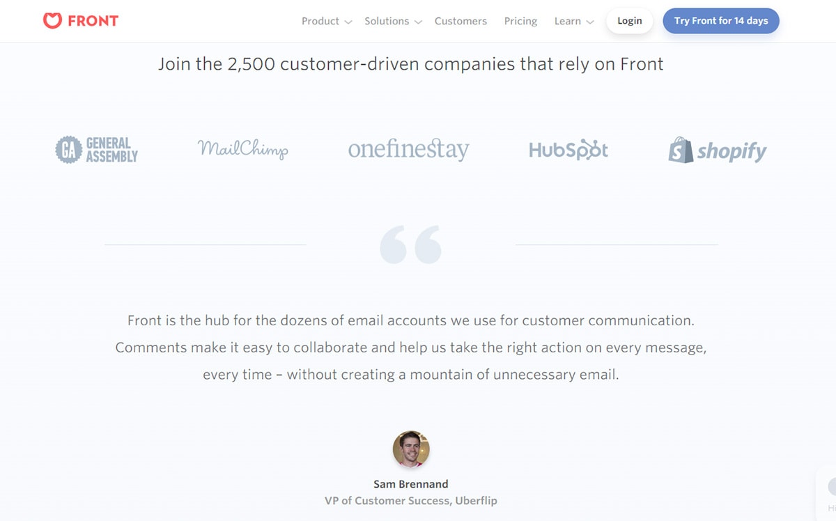
Take the homepage of Front which lists a section of testimonials along with featured badges.
Some of their clients range from Shopify to MailChimp and those brands really make a difference.
Look for these types of badges on homepages in the near future. I have a feeling this trend has barely even started growing.
Diagonals & Slants
You can design some pretty crazy stuff with CSS3. Modern grid layouts are easier than ever to build and that’s leading designers towards more unique layouts with diagonals & crooked page sections.
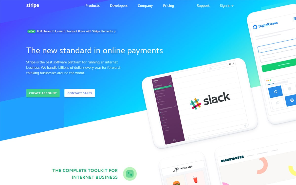
I’ve seen this in plenty of layouts and Stripe is perhaps the most noticeable.
The background colors and gradients naturally slant towards the side of the page. But the same can be said of their icons and graphics too.
Another technique that follows this idea is the use of hexagons and diagonally-shaped elements.
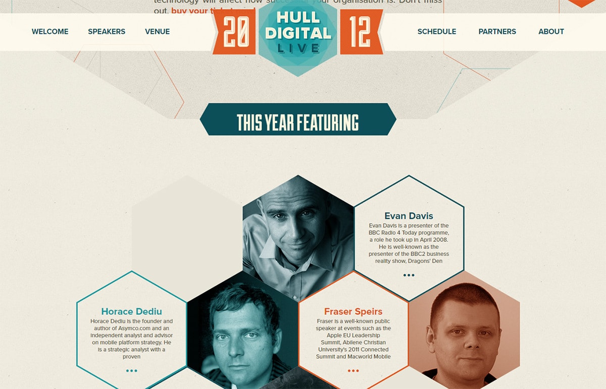
The old 2012 HDLive site has this in their “speakers” section. I’ve seen hexagonal honeycomb designs on many different websites and most of them follow the diagonal design trend.
We actually covered this topic in-depth if you want some more live examples.
Typographic Animations
I mentioned small microinteractions and their rapid growth on the web. But another area of web animation is typography.
This is still in its infancy but I have a feeling it’s gonna blow up over the coming year.
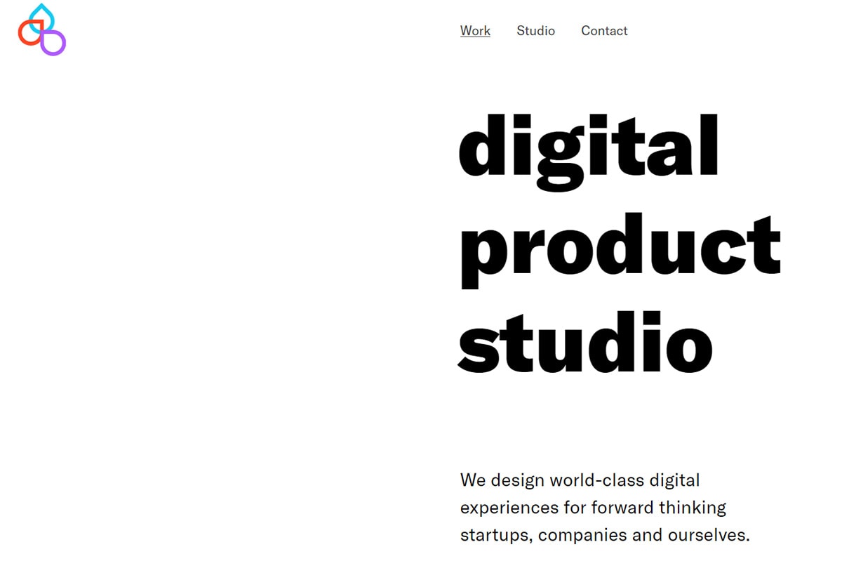
If you know your way around JavaScript you can manipulate letterforms to animate however you want.
The 3drops site does a really simple job of animating text into view on the page. As you scroll it all fades into view and there are some really neat effects mixed into the content.
I mostly see text animations on larger landing pages or creative studio websites, but in time I think this will become much more commonplace on general restaurant sites or small business sites.
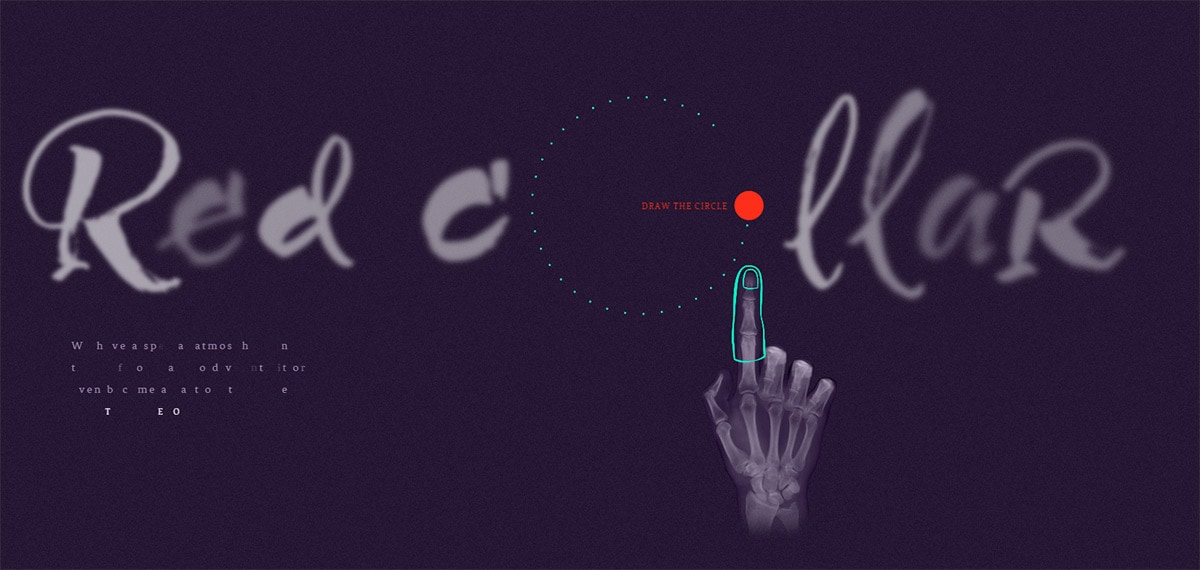
And you can include text animations for almost anything.
They can work as introductory designs to grab visitors attention like on Red Collar’s website. Or they can follow microinteractions by responding to user behaviors.
More Support for Widescreen Displays
Every year I follow these “design trends” posts and responsive design is constantly mentioned. Often for good reason: it’s here to stay.
But that doesn’t mean desktop is gone. On the contrary, most desktops are getting wider with larger displays and more room.
It’s smart to design your site for desktops just as much as smartphones. And I’ve seen quite a few websites following suit with layouts wider than the usual 1440px width.
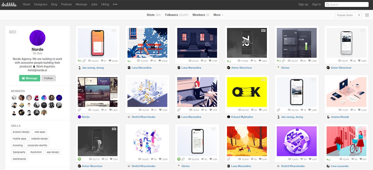
For example the newest portfolio pages on Dribbble all have a really cool grid style.
It basically fills in all the space it can with thumbnails into malleable rows & columns. The screenshot above was taken on my 1920px monitor, and I have a feeling Dribbble supports screens even larger than that!
Another nice example is the Cartoon Network site which spans a good size of my total browser width.
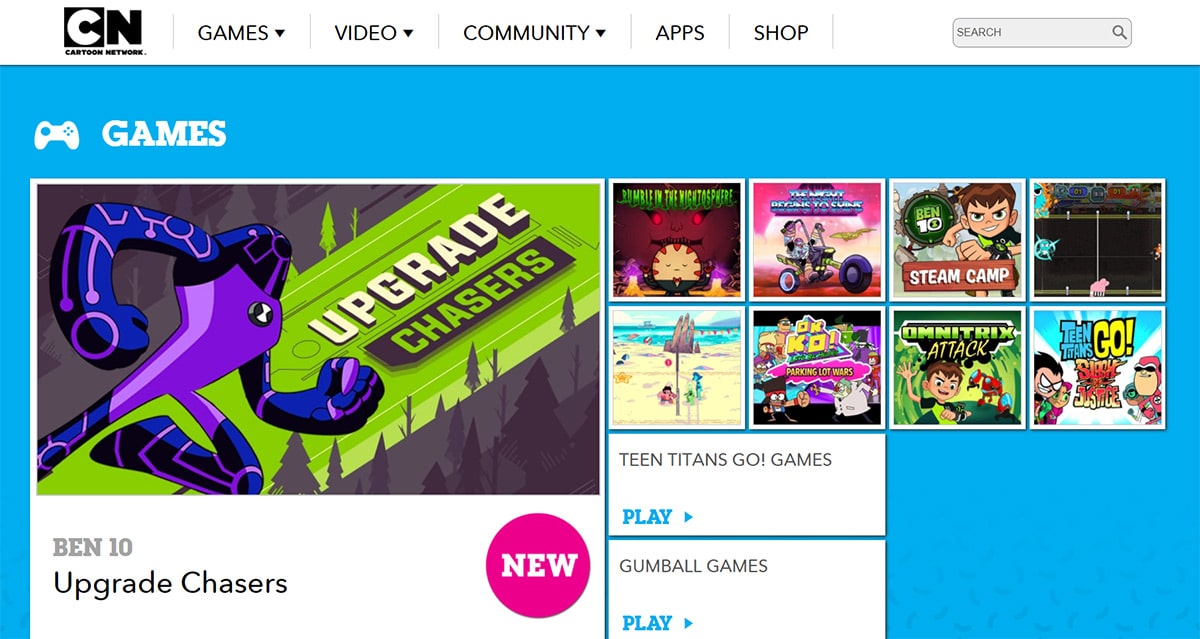
This widescreen layout style doesn’t work as well on blogs or content sites because lengthy paragraphs are harder to read.
But for business websites, social networks, or very detailed webapps, wider is often better.
3D Button Effects
The wildly popular flat buttons and ghost buttons are here to stay. They’ve been around for a few years and both of them blend nicely with Google’s material design language.
And one other button style I’ve seen recently is the 3D button.
This is where the bottom border is darker than the main button color so it looks like the button is raised off the page. Then when you click the whole button sinks down.
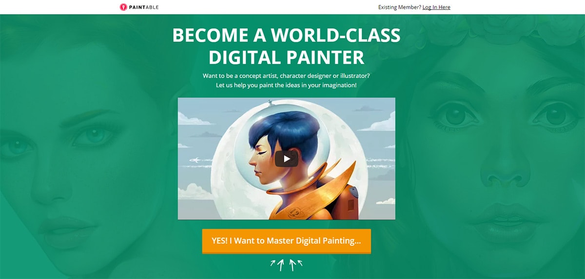
Digital Painting Academy has a great example of this button style on their landing page.
Most of the time you’ll see these buttons used as CTAs because they jump right off the page to grab attention fast.
And 3D effects typically encourage more interactivity from users. But you need to have the right kind of layout to get this working right.
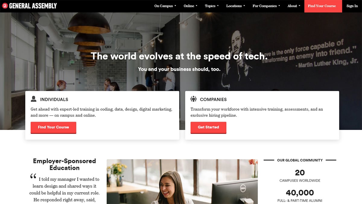
General Assembly has a much subtler 3D effect but you can still notice this on all of their buttons.
Keep your eyes peeled for these buttons in the coming months. I think they’re a viable alternative to the flat trend sweeping through the design world.
True Accessibility
Working with WAI-ARIA specs (Web Accessibility Initiative – Accessible Rich Internet Applications) is a challenge. But the end result is a site full of dynamic features that are accessible to everyone.
Here are some dynamic elements that you may try working on to get fully accessible:
- Dropdown navigation menus
- Photo slideshows
- Modal windows
- Ajax-powered forms
I’ve seen more developers releasing codes for accessible snippets and more websites adopting them.
Granted I still think this trend is in the minority on most websites. But I also think as the years pass it’s getting tougher to ignore accessibility.
While I don’t have any specific examples to follow, I will share a few scripts you might try out that are designed to be fully accessible & easy to use:
- Accessible Modal Window
- Modal Plugin with jQuery and HTML5
- Accessible Data Picker Plugin For Bootstrap
Flexbox & CSS Grid Layouts
It seems like only yesterday when the CSS3 spec was released. Since then we’ve seen a bunch of new properties added to the spec with huge advancements in layout development.
Two features that I see growing in 2018 are flexbox and the CSS grid.
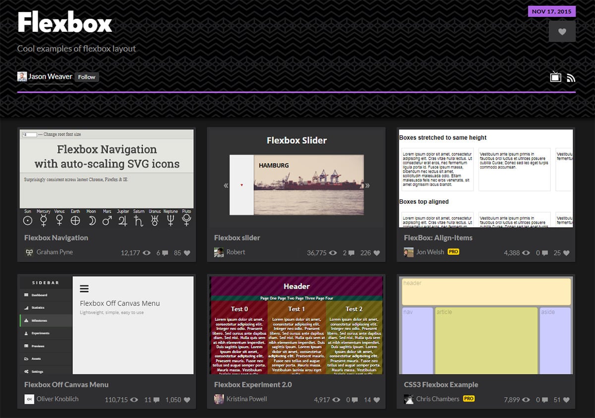
With flexbox you’re working in a flexible box model where the internal containers fit within their parent container, all based on certain rules you define in CSS.
This completely removes the need for floats in certain layouts and gives far more power to the developer.
Likewise the CSS grid property(and related properties) make it so much easier to code full grid layouts with dynamic features.
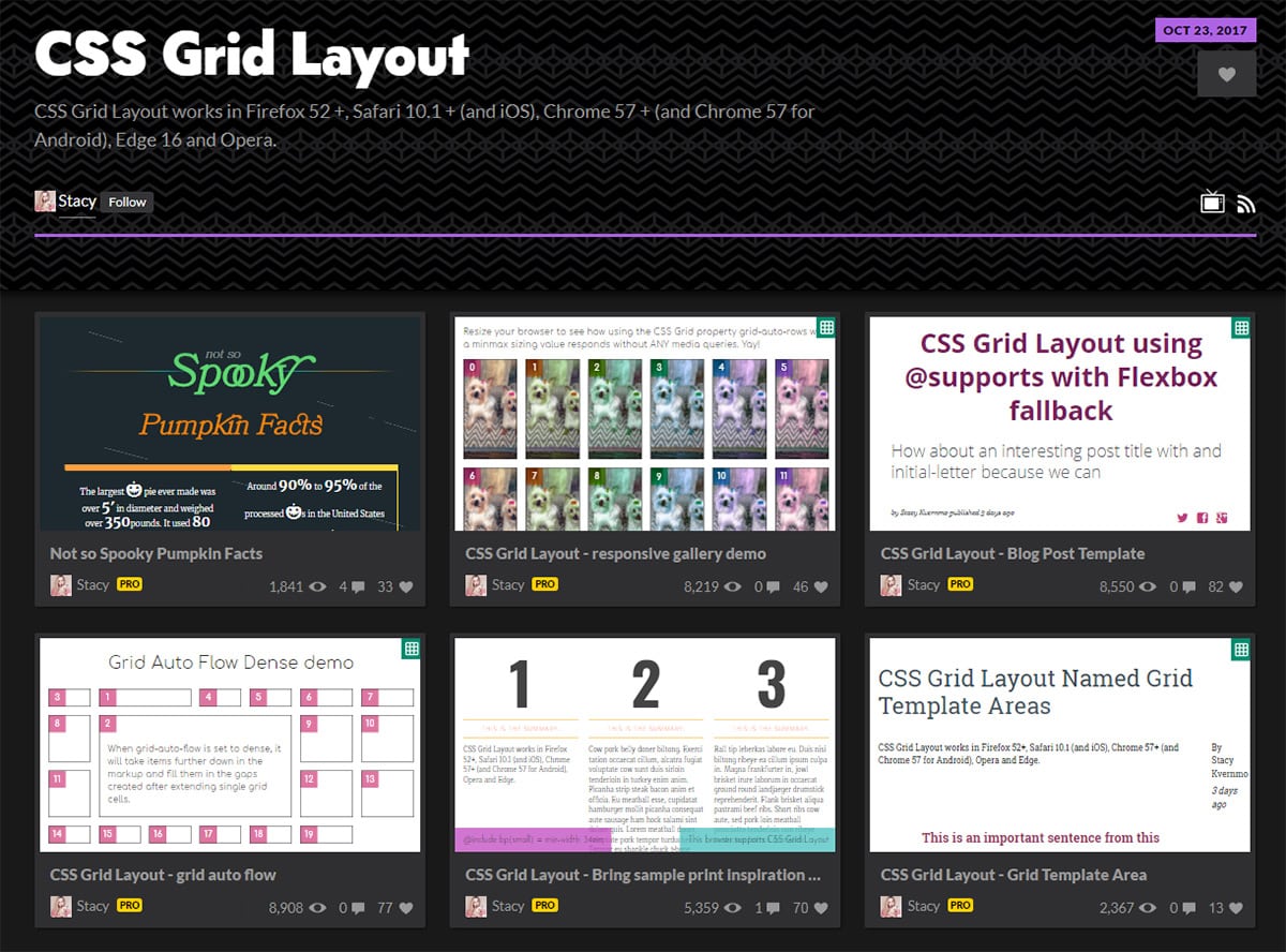
There’s a lot to get into and so much learn for both of these features. But I think CSS-Tricks does an excellent job with their intro guides to flexbox and the CSS grid.
Keep a Lookout for More!
It’s tough to predict which design trends will define 2018. But I always like to watch for yearly changes in web design to get a creative barometer for the years to come.
These are just my predictions but I’m sure we’ll see a whole lot more. If you have any other suggestions feel free to share your thoughts.
All I know is that no matter which trends climb over the next 12 months, it’s safe to say that the web design industry is guaranteed to change.
